The unexpected stories behind some of the world’s most famous brand logos
Logos are everywhere - shops, billboards, on products we use everyday. There might even be a logo on your loo roll..
Research estimated back in 2007 that we see 5,000 adverts (and their brand logos) daily, but with the increase in ad platforms on social media, this number could now be much higher. The most successful logos are the ones we can recognise from just a glimpse - a symbol, a colour combination or shape.
You’d think, considering their importance in getting us to buy things, the most recognisable logos must have taken huge teams months to come up with. But you’d be surprised. Some of the world’s most famous logos were created by inexperienced designers or were just mere sketches delivered in a few hours.
Bitesize picks out some of the most interesting and unexpected stories behind logos you can’t help but recognise.
Coca-Cola
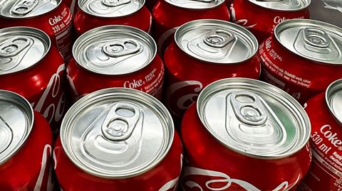
The red and white of a Coke can or bottle label is so distinctive that you don’t even have to read the wording to pick it out on a shelf. Whilst the drink’s inventor came up with the name Coca-Cola way back in 1886, it took until 1969 for its logo to evolve into the version we see today.
Originally, Coke wasn’t intended as a drink at all. It was created by John S Pemberton, a pharmacist in Atlanta, US, as a medicine that could cure a range of ailments including indigestion. His flavoursome syrup was diluted with soda water to make it fizzy and was sold at soda fountains.
The flowing script that appears in its logo was originally penned by the drinks company’s accountant Frank Mason Robinson in 1886. It is thought that he was influenced by a font used by the Federal Bureau of Alcohol, Tobacco, and Firearms. Although the logo was registered as a trademark in 1893, the lettering was inconsistent until 1903 when it became fixed as we know it today. Then, in 1969, the white wave - known as a “dynamic ribbon device” - was added.
Nike
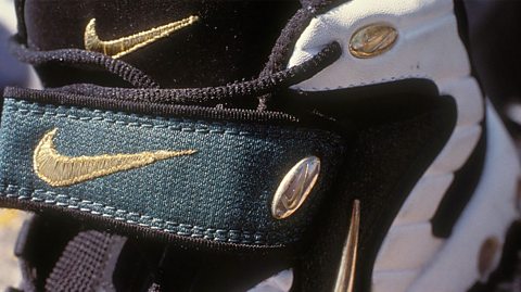
“Well, I don't love it but it will grow on me,” was the reaction of Nike co-founder Phil Knight when confronted with the sport brand’s now famous swoosh logo in 1971.
Originally called “the stripe”, it was created by Carolyn Davidson, a student of Portland State University in the US, who had also come up with four other suggestions including a simple circle or hole, depending on who was looking at it.
Carolyn hadn’t been told much about what Nike was looking for, just that they wanted a logo that conveyed movement. Among other influences, she was inspired by the wings on a statue of Nike, the Greek goddess of victory, in the Louvre museum in Paris.
She was paid just $35 for her work, which went on to help Nike become an iconic brand. However in 1983, to show his appreciation, Phil Knight gave her a diamond and gold ring with a swoosh decoration, another cheque for $35 and 500 shares in the company.
The Rolling Stones
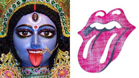
One of the world’s most recognisable symbols of rock and roll, did you know that the band’s Hot Lips logo is inspired by goddess energy and its creator was still a student when he designed it?
Rolling Stones‘ frontman Mick Jagger commissioned John Pasche, who was still at The Royal College of Art in 1970, after seeing his final degree show. For his first commission, a tour poster, Mick told him he ‘could do better’. So by the second commission for a band logo, when Mick handed over an image he liked of the Hindu goddess Kali, John knew he had to go big.
Representing feminine power in the Hindu religion, John also thought the tongue sticking out captures a sense of rebellion and anti-establishment thinking, reflecting the Rolling Stones’ personality and song lyrics. Mick and the band loved it. John was paid £50.
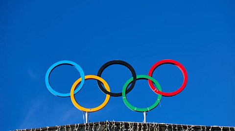
The Olympic Rings
What’s the strangest fact you know about the Olympic Games? Is it that tug-of-war used to be one of the competition’s official sports? Or maybe that for around 1,500 years they didn’t happen at all? Or is it that the founder of the modern Olympics, Pierre de Coubertin, asked for his heart to be placed inside a marble monument at Olympia in Greece after his death?
Luckily De Coubertin’s motivation for bringing back the Olympics was much more wholesome. His aim was to help the world become a more peaceful place by using sport, and the competition, to educate young people.
He also designed the Olympic logo to reflect this: five rings of different colours, each representing a different continent and so including every nation on Earth. According to the Olympic Charter, they symbolise; “the meeting of athletes from throughout the world at the Olympic Games”.

McDonalds
The yellow Ms on McDonalds packaging started off on the roof, when the original restaurants were designed in the 1950s and ‘60s.
Dick and Mac McDonald, brothers who grew their fast food empire from just three drive-throughs, wanted their businesses to grab the attention of passersby. So when architect Stanley Meson came up with locations featuring red and white stripes, a red and white sign and a flat roof, this wasn’t eye-catching enough. So the two golden arches were added.
By the late-1960s this design was swapped for a “mansard roof”, which had a double slope, a popular style in France 150 years ago. The golden arches were not completely lost however, as by then they had been incorporated into the McDonalds logo as a large yellow M.
This article was published in August 2025
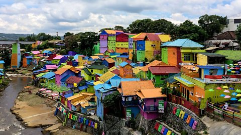
Five must-see pieces of public art
From walls to train stations to entire villages – artists have taken ordinary surroundings and turned them into things of beauty
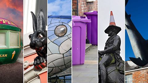
Six unofficial landmarks that UK towns and cities fell in love with
Glasgow's Duke of Wellington statue, Liverpool's purple wheelie bins - and a big fish in Belfast
The Bitesize art movements quiz
Who was that Pop Art hero? And which famous name helped create Cubism?